Wednesday, 15 February 2017

Forest Golem Project

Forest Golem Project


Concept - The concept began as a design for a games competition, originally it was just going to be a big creature for a top down tactical game with the style of a medieval golem. I like the idea of this big, heavy, forest creature being able to smash up rocks and roams about the jungle being a guardian of the forest.


Building Blocks General Idea

The game didn't end up making it past the concept stage however I still had strong ambitions for this character so I wanted to make it. Throughout the development process several things had changed to help develop this character's story. Its features were mainly designed around the sheer bulk and force combined with a cape (originally a forest green style but developed later into a contrast colour) to resemble belonging once to some sort of tribe or community. Its other feature was that of a series of wrist blades which it could use as a weapon, perhaps in combat or in hunting.


Building the base mesh:


After the character was initially grey-boxed I then decided that I wanted to optimise it for augmented reality. The story for the animation was shortly based off how I would want the viewer to play through the experience, but I also wanted to present his personality more and give a taste of what kind of things this creature does while in the forest. I decided to go for smashing a rock, as it was pretty simple and helped show off the immense strength of this golem. The best AR experiences are shown through quick and effective methods, so using this approach I developed the scene and character in accordance. 

The environment consisted of several foliage assets of rocks and grass etc. As well as a place from which the character could "spawn" from. I started by building the standard shapes needed for the scene such as the rocks, that he will break in the animation as well the cave/hole from where he comes from - originally I wanted to make this a ancient temple but a square/block shape would not of worked for this concept especially if it was been viewed mainly top down. A 60-45 degree cave would work best, being that it is an AR experience. I started this process by importing the basic shaped into Z-Brush and sculpting away the shapes and cracks in the rocks, below is a render of the High-poly mesh. The next stage involved re-typologising over the high poly to make a low poly. Then using X-Normal I baked the high-poly detail onto the low. 


Texturing:

The next stage brought me to the texture process and because this was an AR project that was going to be viewed via a mobile device I had to make sure all detail was optimised. For this I made sure that each object only had on texture per mesh. In this instance I created 5: for the Golem, his assets (cape, mask, claws), one for the golem's shadow rocks and cave, and scene. All textures are unlit shaders which means I created lighting and shadows within Maya.


Extra additions:

Final details that I added from the original model were a mask for the golem. He seemed to be a bit bare in design. I wanted to give it more design to resemble belonging once to some sort of tribe or community. This community may of used animal masks for rituals or in combat situations, also gave me a good excuse to include "glowy" eyes - who doesn't love glowy eyes eh? After all the finalising of the textures and scene I then decided to rig and animate the character to pose him in shots in which I could imagine what would bring the creature to life.

Execution:

The final result of the character was fully tracked and able to view via an AR code, image below provided. I have also included a link to the sketchfab version of the model to get a good look at the scene. Feel free to scan the image, using the Zappar App on the Android or App store to see the finished results! The process on creating this end product, meant having to spend some time learning the Zapworks Studio software which enabled me to create the content I wanted and view it in augmented space. I had a little help from an expert in the field to help speed this process along. I also had another friend who worked on the sound for the experience to help give this character even more life than before, the sounds help define the jungle/forest background in which this creature inhabits, along with a powerful roar that can be heard for up to 10 miles away (Note: in the universe not real life). I have learnt a lot from this project, mainly it was a practise, for understanding how to create such a story in such a small space, as well as learning more about AR and 3D in the process. One of the most difficult times I had on this was the Rigging stage mainly because of the anatomy of the creature was slightly a combination of human and creature. My most successful part I think, would be the scene as I believe I that I managed to capture the look I was going for with the lighting and the colours. I think if I was to re-create this scene I may think about making a night time version with more colourful and subtle lighting, it would be a big difference from this current day time scene and I believe would be more appealing from an entertaining perspective.


Thank you for reading! I hope you enjoy.


Download the Zappar App to view this.


Thursday, 5 March 2015

Anatomy Study - Torso

So after several attempts to create a Golem in Z-Brush, I kept finding I had problems with its anatomy. Even though its non-human it still needs to have certain human characteristics, and its main problems was with its torso (don't want to post a picture as it was very rough). I learnt that I could only produce the basics I.e. the chest and back, because of this I found that I need to look into the whole torso and how all the muscles join and work together.

That's what I did, I did some research and had a good read through a book I own titled "Atlas of Human Anatomy for the Artist" By Stephen Rogers Peck. Whilst using several images as reference I spent several hours in Z-Brush putting together the basic building blocks of its muscle groups. The book itself is an amazing guide to the whole human anatomy that I would suggest it to any artist. I then spent several more hours throughout a few days adding extra bits to give it more details and improve the general structure to the anatomy. The final parts to the piece where creating the flow of the muscle groups which helped me to learn how each muscle connects and works together to create motion. Underneath are the finished results as well as a 360 Render.
Thanks for reading! :)


Wednesday, 7 January 2015

Frankenstien Table

This is an asset I created for a game that never managed to take off, however has been put on hold for a possible future use. This started back when I went to a game hack event back in May (2014) in which we created a game where you have to create a frankenstein to assist you through waves of zombie attacks. Originally it was suggested to make the game specific for IOS and Android however we decided we could also make it for PS Vita so I spent a little bit more time and added extra details to it. Modelled it in Maya to get the basic silhouette, then Z-Brush to add details, and then I used X-Normal to render out the AO and the Normal maps. I finalised the piece using DDo which I recently purchased to fix up the textures and rendered it all in Maya.


Wednesday, 10 December 2014

Portfolio Piece - Bioshock project

The start
I have recently been playing Bioshock, I never actually played the game before however I've played Bioshock infinite. So I decided to go back to the first game and play them through again from the start. I got to this point in the game and thought it was pretty cool, its around the third level in the game where you have to create a device that brings living plants back from the dead. I haven't spent much time with organic props (Plants + Trees) also would be good practice to create this kind of environment. It was also at this point I realized how amazing the environment work really is in Bioshock. Using Several images I found on google I managed to form a series of reference images from which I map out the environment with. It is very tricky to figure out environment from just images so I also found a youtube video to help aid with scale and position of all the objects.

Scale - I had to create a scale guide so I used a stylized zombie I made a few months back. 


Blocking out parts
After blocking out where everything goes I decided to start to concentrate on several areas. The first area I chose was the main focus of the room which is up on the higher platform where the player interacts with the machine.

The machine has a lot of things sticking out so this took a while to put together some of the parts are pretty basic as the extra details can be added with Normal maps. However there are parts which are fairly high poly as I what it to have plenty of details. The platform is pretty much complete it just needs extra details added to it then on to the rest of the room.


Update 17/01/2015

Adding details
So during the holidays I've been fairly busy finishing off other projects and spending time with family I haven't had much time to do any of this. I have however spent a few hours here and there adding in some details through using Z-Brush, I then have been using X-normal to render out the Normal and AO maps. Most of my time I have spent tweaking the maps so that they do show anything that shouldn't be there.

For the machine I added in some quick textures to make it more part of the scene and so that it doesn't look completely bare. I've basically isolating an area of the room that I can then compare the rest of the room to when it comes to quality. The next step is to add textures and finish blocking out the rest of the room.


Wednesday, 26 November 2014

Hello again blogger!

I haven't blogged in a very long time, here is what I have been up to the past few weeks...
So I am doing some work for a games company called Glow Games Studios and we are creating a game called Dungeons and Robots. My role in this project is lead animator so I have been very busy with animation recently. The first two videos show animations I made for a Shadow Creature which is quick and agile, it likes to teleport around the dungeon and sneak up on its foes. The second two show a Fire Golem being brought to life, the big brute absorbs lava from the ground and fires it onto the player. This is a special attack and does plenty of damage however it is a slow attack and easy to avoid. This animation specifically took a bit longer than most of the other animations as I had to tweak tiny details over a long period of time.

More about Dungeons and Robots: http://www.indiedb.com/games/dungeons-and-robots
Follow for more updates: https://twitter.com/


Wednesday, 12 March 2014

Mini Portfolio 12.03.2014


This is a sketch of a current creature I have produced in the beginning process, which is meant to resemble an Alien/Chicken creature. The main features at this current stage was the posture, and the over-exposed chest-cage. The gas mask is there to represent the creature not being able to breath in our atmosphere, and also its a little creepy.


This is a more finalised design of the creature, that shows most of its functionality within the multiple joints of the leg.


This is a finalised design flow of the creature in 3D, starting with the low poly mesh then onto the high poly sculpt in Z-Brush. It then follows onto a re-meshed low poly version with the high poly one baked into it.


This is some environment concept I produced last year for a previous game project that was a 3D side-scroller.


Another environment design I have produced for our current game.


One of my recent sculpts, a creature inspired by having over sized arms and using them instead of its legs to walk upon.


Thursday, 9 May 2013

Night Crawler

The nightcrawler was an assainment I had to to were I had to see how far I could go with a low poly model within the space provided.This is my model practise of nightcrawler, Showing a front and side view. I also have included some more interesting shots so the typology is nicely presented. I found this assianment pretty easy as typology was easy to muster up.


Thursday, 2 May 2013

Sea Creature

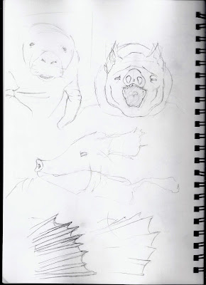
I started off my concept of looking into abnormal type of marine creatures, and I found some images on manatys. I used the inspiration of being described as a sea cow and implemented my own marine creature. I came across with the idea of a sea pig, reasons that lead me to think that they are a type of creature not know to be mixed with under water. I also thought it could give an interesting concept towards the idea of a newly formed underwater mamal. I gave the creature more of a fat manaty look with lumpy fins. I would like to finish the creature by texturing and to re-light some of the scenes.


Update: I have managed to texture and create a final render for my underwater creature. I found the texturing very tedious and the rendering fairly difficult as I was trying create an under water effect which didn't go so well.


Thursday, 25 April 2013

Minotaur!

This week my assianment was to create a minotaur, based on selection of videos we were sent to work from. I have produced most of the stages for the minotaur up on to the point of adding further detail. I found it pretty tricky to follow as most of the work was done in a fast pace and difficult to follow. Here is where I got to https://www.youtube.com/watch?v=OsrKvnC0nIc.