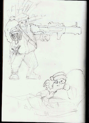
This is a simple layout sketch I did of santa the top one being a form of him looking like a badass, in which I could use for a composition of him killing zombies for example. The bottom one is in a different perspective showing an interesting style in which I could use space around him.
This image I'm not to happy with as I planned it out to be in 3 styles, the first being a sketch style, and the next being a wireframe, with the final being coloured. This is an idea to create a scene showing the progressing of creating a piece of art all in one composition.


No comments:
Post a Comment